


When it comes to career sites - there are often so many factors to consider, and so many components, it can get complicated and complex - to the point, it might seem impossible to change.
But the truth of the matter is - career sites don’t have to be so complicated, as long as you make sure to highlight a few necessary things.
We’ve collected our 4 must-haves for a career site - and scattered the world wide web to find you the best examples for each.
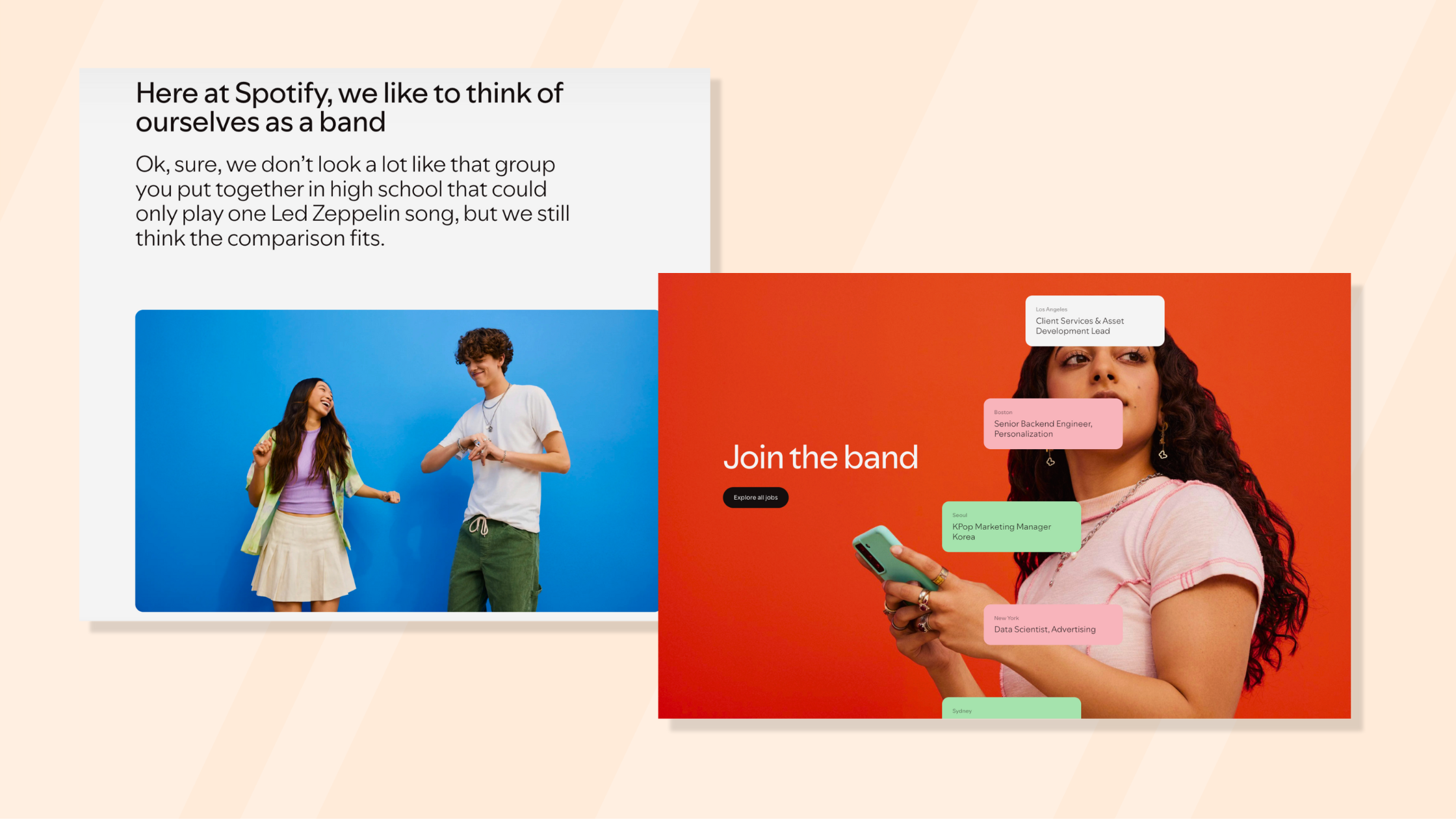
It sounds so obvious, but truly - your career site is just like a first meeting - There is no second chance for a first impression. Make sure to highlight who you are and what makes you stand out, but stay true to yourself. Spotify is a great example of using the terminology of your product while showcasing your value and what makes you unique. Spotify has a strong culture, displayed front and center on their career site - to ensure your expectations align. Not only do they share who they are - they also share who they are not - which is just as important.
Oatly is a well-known brand, not only because of its products - but more so because of its online presence. Their tone of voice and social media usage are truly unique. Do they keep that in their career site you ask? Yes - they do! Their career site is unlike any other - it’s playful, it’s filled with puns, and although it doesn’t follow any of our other advice - it represents them perfectly.

Think of your user journey -
It's crucial to understand the steps our users are facing and try to cater to their needs. If all they are looking for is your open roles - placing them in a visible easy location will lower the chances of drop-out before applying. If they’re looking for information - make it clear where they can find what they need is best. We love clever copy, funny puns, and incredible design - just make sure the clarity is not lost in translation.
It might seem like a no-brainer - but Patagonia’s career site is what you’ll find under simplifying in the dictionary. The search bar is the first thing you’ll notice - and offers pre-populated search terms to assist you with finding what you’re looking for.
Expedia took it another step forward and is giving you stats and information about how many open roles and where they are hiring - to help you make a quick decision.

Remember what you’re selling -
Employer brand is all about the experience of working at your company - so if you’re using Shutterstock images, or only have inanimate objects in your career site, it will seem like you’re hiding something. Show your candidates who they might work with, and where they might work - they’ll connect to it better. When it is time to set the scene, Starbucks does an incredible job at showing the behind-the-scenes - presenting their employees while at work - making coffee, serving customers, etc.

Target is also a great example of showcasing employees where they work - in the stores, distribution centers, etc.

Direct your message to your audience -
Create a mix of talking about your company and culture, your audience, and how they fit in. People love nothing more than to talk about themselves - try to activate that to increase your engagement.
H&M career site allows you to choose the path you’re most interested in - selecting what you are passionate about and seeing how it fits with their open roles. Similarly, Southwest presents its departments by what fits you.

Ready to recreate your career site and need advice? We're here to help!
